WithMe web platform for
invoicing & payments
Overview
From its inception in 2011 until late 2014, OrderWithMe (formerly known as WithMe) focused on providing small business owners and major suppliers across the U.S. with a user-friendly platform for ordering, invoicing, and payments. Following two major design iterations and continuous feedback from a diverse customer base nationwide, OrderWithMe recognized the need for a significant restructuring of its web platform, placing a strong emphasis on user experience.
The project commenced in early 2015, with the initial build going live in August of the same year. This endeavor was a collaborative effort, with my role encompassing both UX and UI design, closely supported by a UX director and design manager.
Challenge & solution
At the time, the existing platform, along with other traditional B2B software solutions, presented challenges in generating, managing, and paying invoices, often resulting in redundancy, time wastage, and confusion. These issues could potentially lead to revenue loss and decreased productivity for small business owners.
After extensive feedback collection from our customer service team and thorough field research, our team arrived at a critical solution: an intuitive, task-oriented platform that streamlined user workflows, enabling users to accomplish their tasks efficiently.
Process & tools
As a team, we commenced by whiteboarding potential flows for the platform, engaging in continuous critique and discussion with business and development teams. Over the next two months, we translated these conceptual sketches into raw visual prototypes using OmniGraffle. Subsequently, we developed raw clickable prototypes using basic code to visualize the entire flow.
Once we established a foundational user experience, the subsequent two months were dedicated to crafting the visual design to enhance product appeal and usability. During this phase, I played a significant role, utilizing Photoshop CC and adhering to the newly introduced Google Design Materials guidelines, coinciding with our company's recent rebranding.
Following multiple rounds of constructive feedback, the final design was delivered to our development team in increments compatible with our agile cycle. By mid-August 2015, the redesigned platform was successfully launched to our customers.
Result
The newly designed interface was officially unveiled by our business team at a prominent co-op conference in Austin in late August 2015. Over the subsequent six months, we observed a 9% increase in new user adoption, a 24% reduction in customer support calls, and notable improvements in user reviews, as the platform significantly enhanced our users' daily workflows.
However, in mid-2016, our business model pivoted towards the retail sector, signaling the end of our B2B platform. While it was a challenging transition for our team, it was an integral part of the startup experience, preparing us for the next significant project ahead.
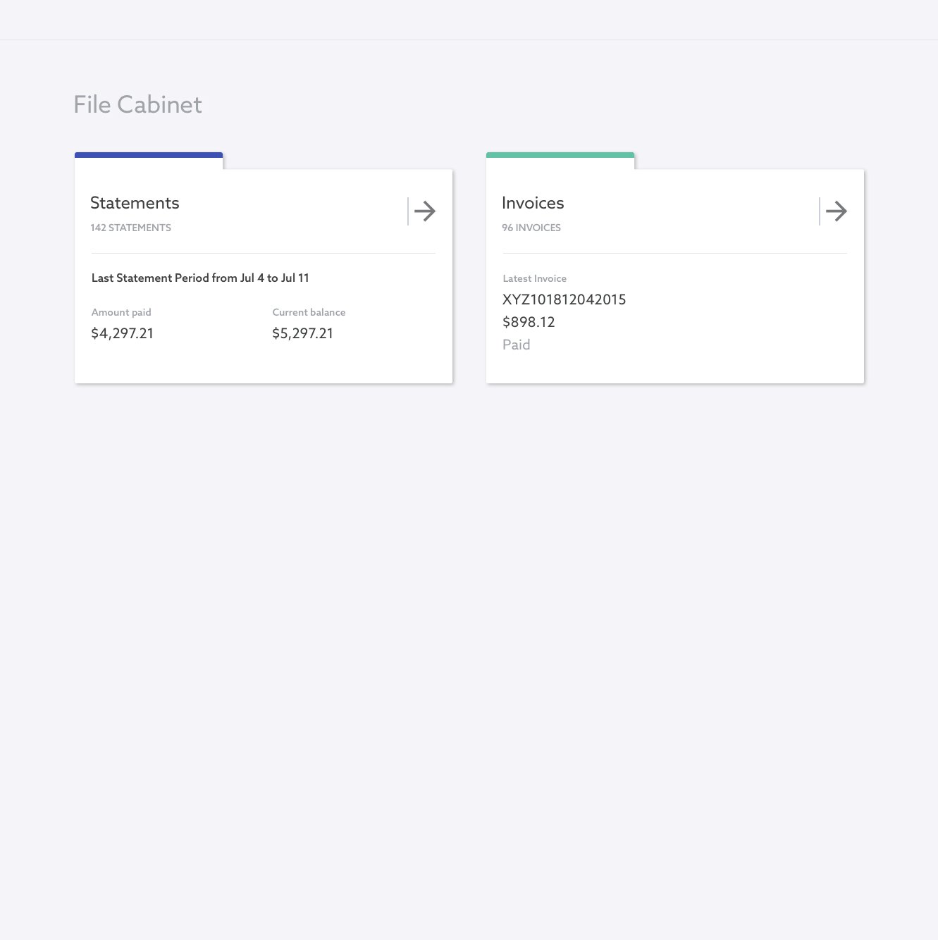
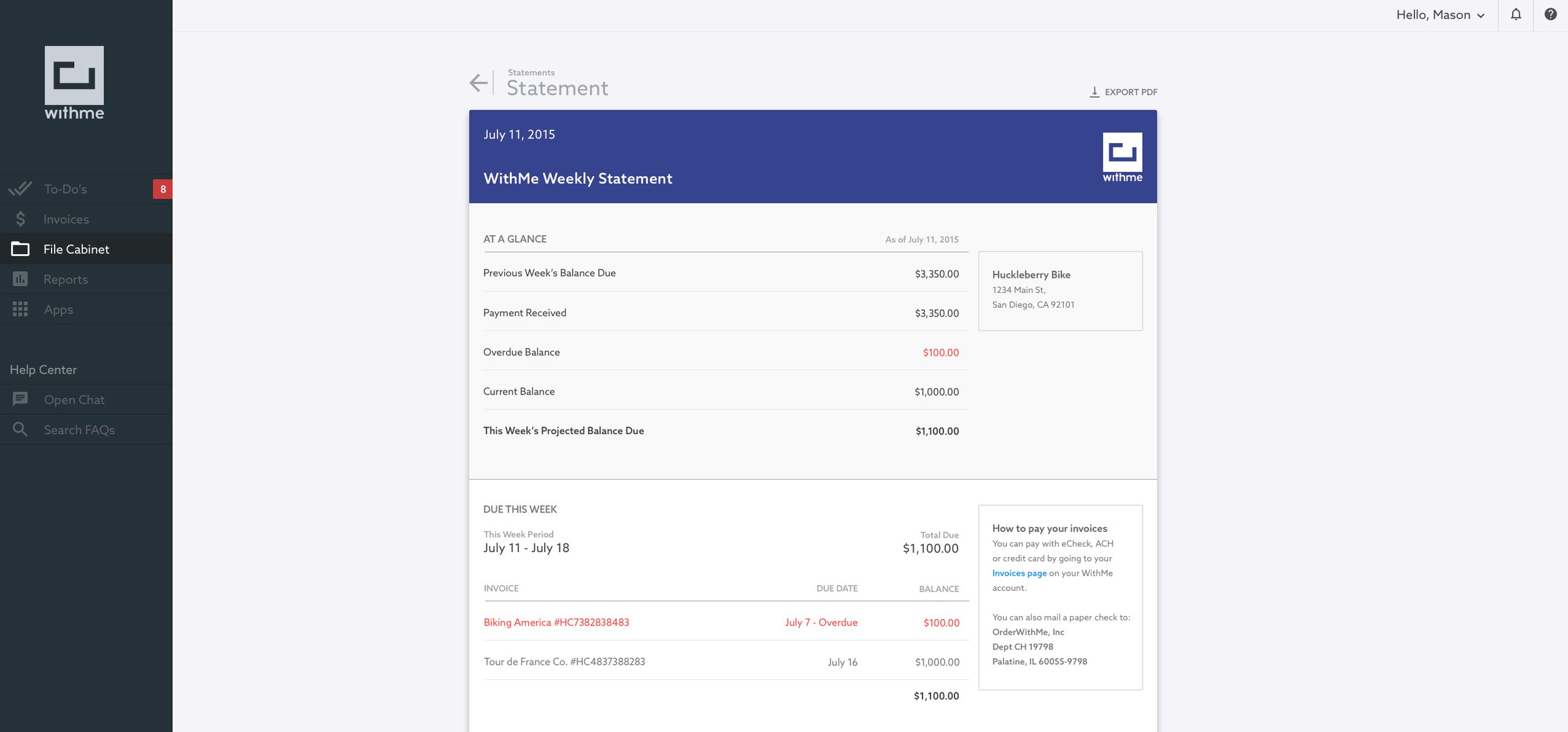
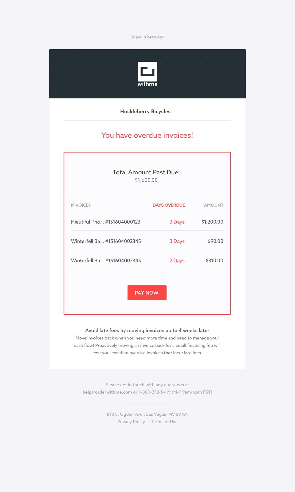
Above: One of the most-used flows in the app where it allows user to Pay Later for invoices | Below: screenshots of a few other instances in the web app + the UI kit


