OVERVIEW
Since founded in 2011 until the late 2015, the main focus of OrderWithMe (former name of WithMe) was to provide small business owners as well as major suppliers across the U.S an easy-to-use platform for ordering, invoicing and payment. After going through two main design phases in the early years existence with constant feedbacks from a great diversity of customers across the country, OrderWithMe needed another solid restructuring of its web platform starting with an extensive focus on the user experience.
This project started in early 2015 and the very first build was pushed live in August 2015. This was a team effort with me playing a role of both UX and UI design with close collaboration with a UX director and a design manager.
CHALLENGE & SOLUTION
With our existing platform at the time as well as other conventional B2B softwares out there, the task of generating, filing and paying for invoices was generally redundant, time-consuming and sometimes confusing which could lead to loss in revenue and decrease in daily productivity.
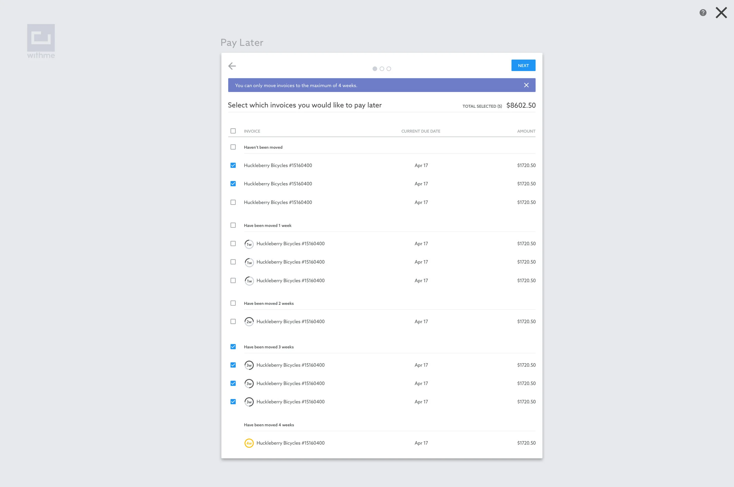
After gathering feedbacks from our customer service department along with doing extensive researches on the field, the critical solution that our team came up with was an intuitive task-based platform that would allow our users to get in and out to finish their tasks in a much more productive manner.
PROCESS & TOOLS
As a team, we spent the first one month whiteboarding all the potential flows on our walls with constant critiques as well as discussion with business and development team. The next two months we spent turning these high level sketches into raw visual prototypes using OmniGraffle. We then created raw clickable prototypes in basic codes so we could envision how the entire flow would work.
Once we formed a foundation of how the experience should be, we spent the next two months creating the visual design to make sure our product is appealing and delightful to use. I did a lot of the heavy lifting parts during this phase. Photoshop CC was my main tool and we were following the brand new and highly anticipated Google Design Materials guidelines.
With lots of constructive feedbacks along the way, the final designs were handed off to our development team in batches that fit into our agile cycle. By mid August 2015, we were able to push the very first build with this design overhaul live to our customers.
RESULT
Our business team officially revealed this newly designed interface at a big co-op conference in Austin in late August 2015. The next two months we constantly saw the increase in our customers satisfaction. We did have a few hick-ups in the backend environment but overall the customers appreciated this new platform as it boosted their daily workflows significantly.
In early 2016, our business model took a significant turn into the retail sector and that meant we would no longer move forward with the B2B platform. It wasn’t easy for our team to see it go but it was part of the experience being at a thriving startup. We were ready for the next big project.